Mooeey Bakery | Mobile App
Project Summary
Mooeey’s Bakery, is a hypothetical local bakery that I used for my Google UX Capstone project. The baker offers diverse selection of Asian-French sweet and savory pastries and drinks. Understanding food serves as a universal love language and fostering memorable experiences, Mooeey’s seeks to provide great customer service and experience both in-store and online. Busy and frequent customers often find themselves spending time waiting in-store to place to-go and large orders.
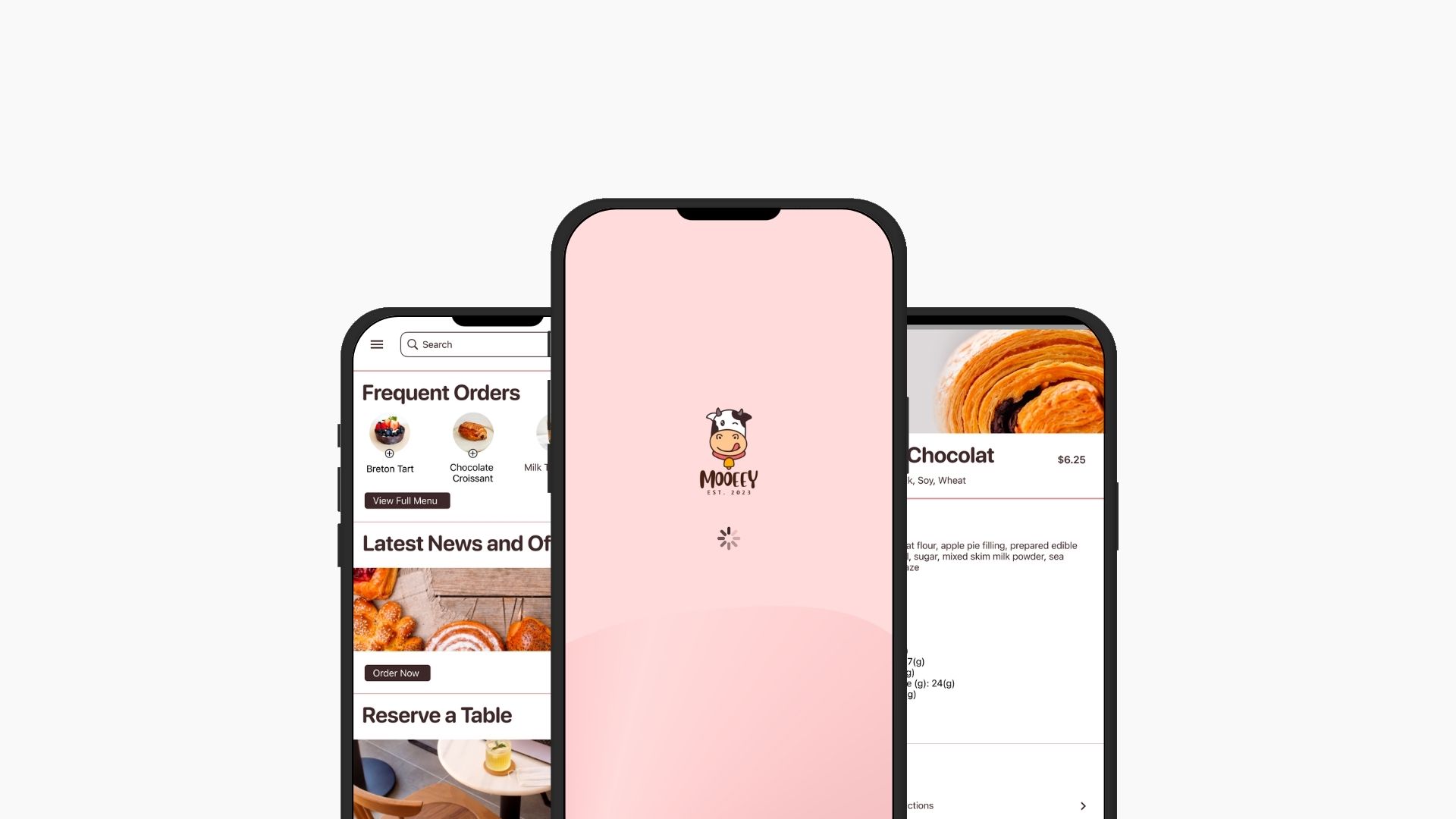
The project’s goal is to design a tailored mobile for Mooeey’s Bakery offering customers with a seamless experience. The app will allow customers to effortlessly place online orders in advance and simply stop by the store for quick and convenient pick up.
"How might we help customers seamlessly place order in advance from their phone?"
My Roles and Responsibilities:
As a UX Designer, I was responsible for
- Conducting user research to understand customers needs and preferences
- Designing both paper and digital wireframes
- Developing low and high fidelity prototypes
- Conducting usability studies to gather insights and feedback for iterative improvements
- Iterating designs based on research results, ensuring the final product meets user expectations and enhances the overall customer experience.
UX Approach and High-level plans
The process follow Design Thinking process, starting with Discovery phase, then defining problem, Build, then testing and QA.
The Design also followed user-centric approach with the following principles in mind:
— Usability: Consider intuitive navigation, clear Call-to-action, and easy to follow content.
— Consistency: Maintain consistency in design elements, following brand guidelines to create a cohesive look and feel.
— Accessibility: Ensure the website is accessible to all users, including those with disabilities. Make sure the design complies with ADA standard. Consider provide options for voice control functionality.
— Visual Hierarchy: Use visual hierarchy to guide users’ attention and journey
Tools: Figma, FigJam, Canva
Project Process:
My UX Design process adhered closely to the Design Thinking framework, embracing 5 key stages:
- Empathize/ Understand: I conduct a competitive audit, user research to empathize with users and understand their problems and needs
- Define: from that I defined the problems by distilling insights from the research, pinpointing the pain points, and establishing clear objectives.
- Ideate: I generated creative solutions to address the identified challenges and marked favorited features throughout the process
- Prototype: I translated ideas into designs, creating paper and digital wireframes, mockups, low to high fidelity designs
- Testing: I conducted usability studies to gather user feedback throughout the process to iterate my design and ensure alignment with usability, accessibility and expectations.
Empathize & Understand the Users
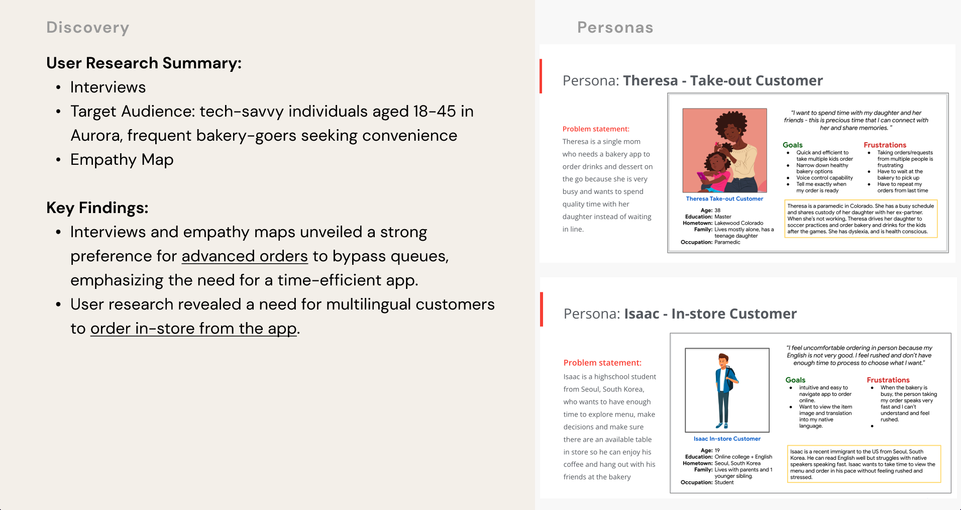
User Research Summary
In this Discovery phase, I conducted user research, created user personas with a clear problem statement and user journey for each of the personas. Then based on the search finding, I identified the main user pain points which I used throughout the rest of the projects.
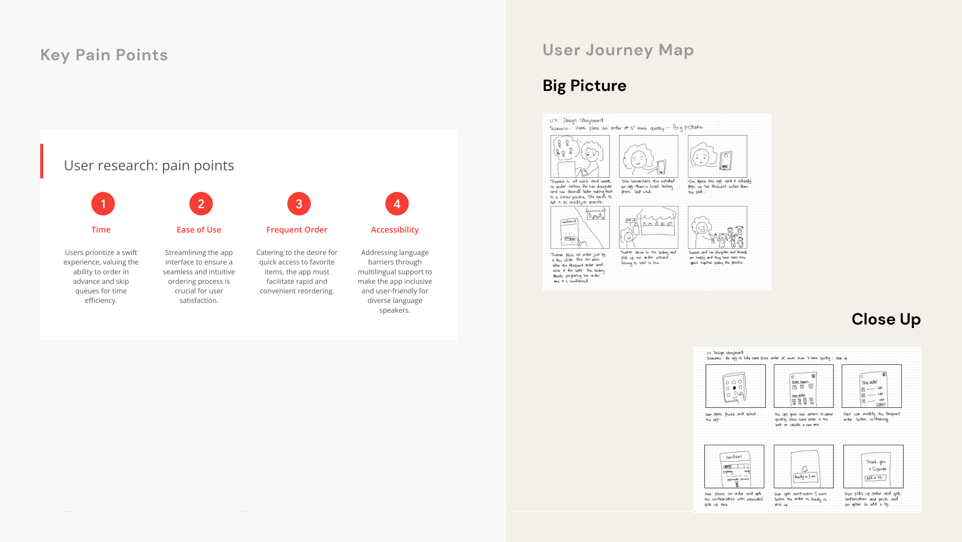
The user research focused on frequent bakery consumers, tech-savvy individual aged 18-45 in Denver, Colorado. Through interviews and empathy maps, I identify their desire to bypass queues and optimize time. They tend to prioritize pre-ordering for efficiency. Surprisingly, language barrier was also an obstacle for non-English speakers ordering in person, creating a need for a multilingual support in our UX Design. These insights guide the design towards prioritizing quick orders, advanced ordering, and inclusivity for Denver’s diverse community.
Key Personas and Pain points
Journey Map (Big Picture & Close Up)
Wireframe:
Paper wireframes:
I meticulously crafted paper wireframes, iterating through screen scenarios to prioritize the frequent order process—saving users time. These prototypes serve as a foundation for digital wireframes, ensuring a user-centric design that tackles efficiency, ease of use, and accessibility based on identified pain points.
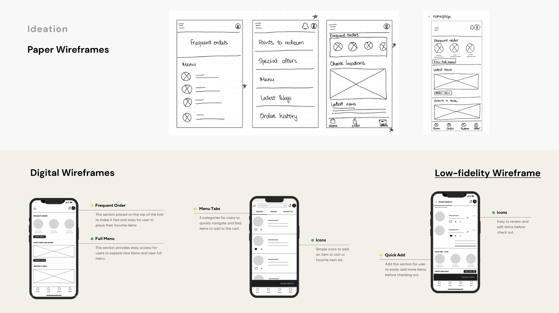
Digital wireframes:
Next, I blended user research findings with refined paper prototypes in the digital wireframes. This step focused on translating insights into an interactive interface that prioritizes efficiency, user-friendly navigation, and inclusivity—directly addressing identified pain points for an optimal user experience.
Prototypes:
The low-fidelity prototype connected the user flow of viewing menu, selecting items, and placing an order on the bakery app.
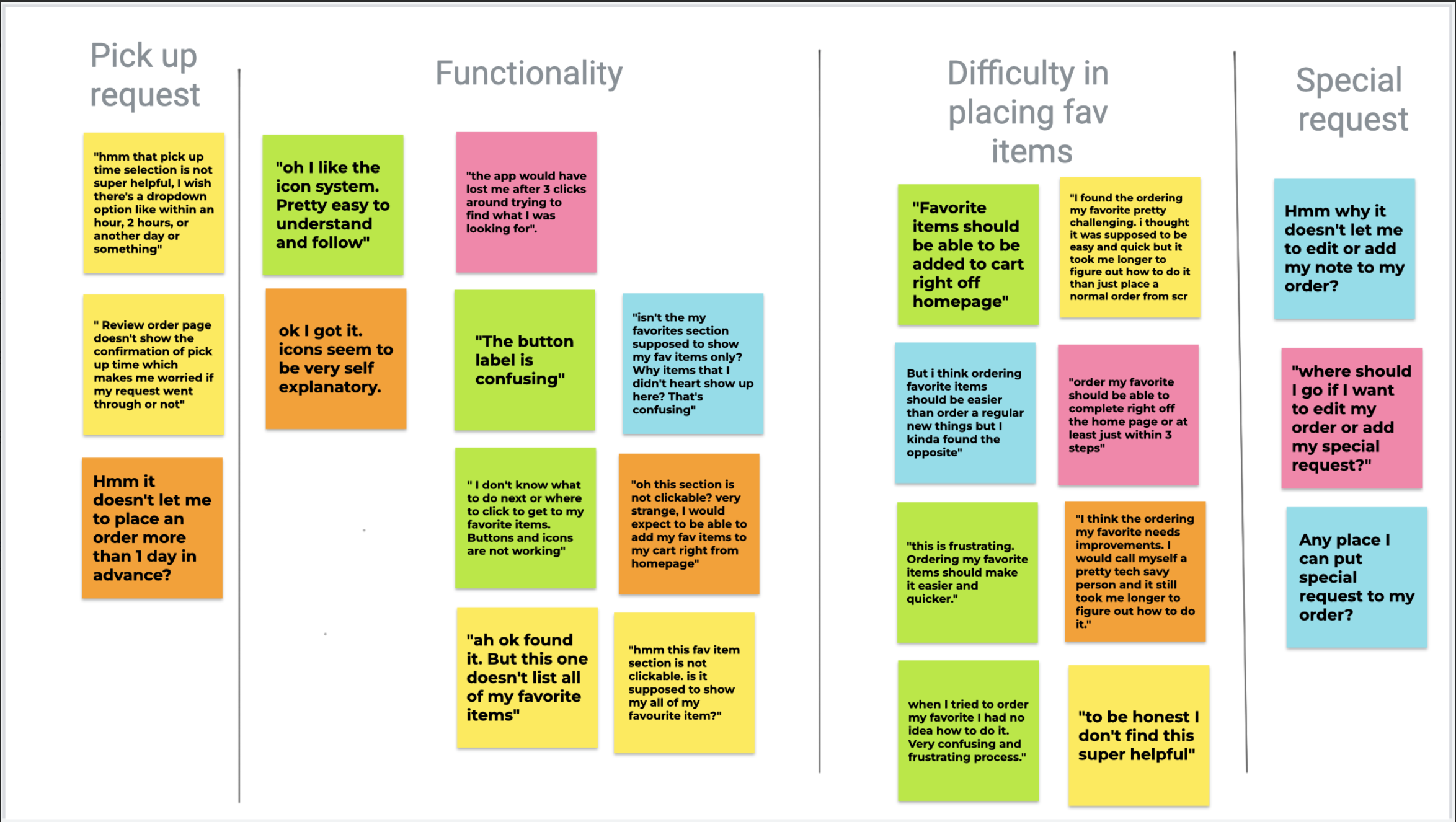
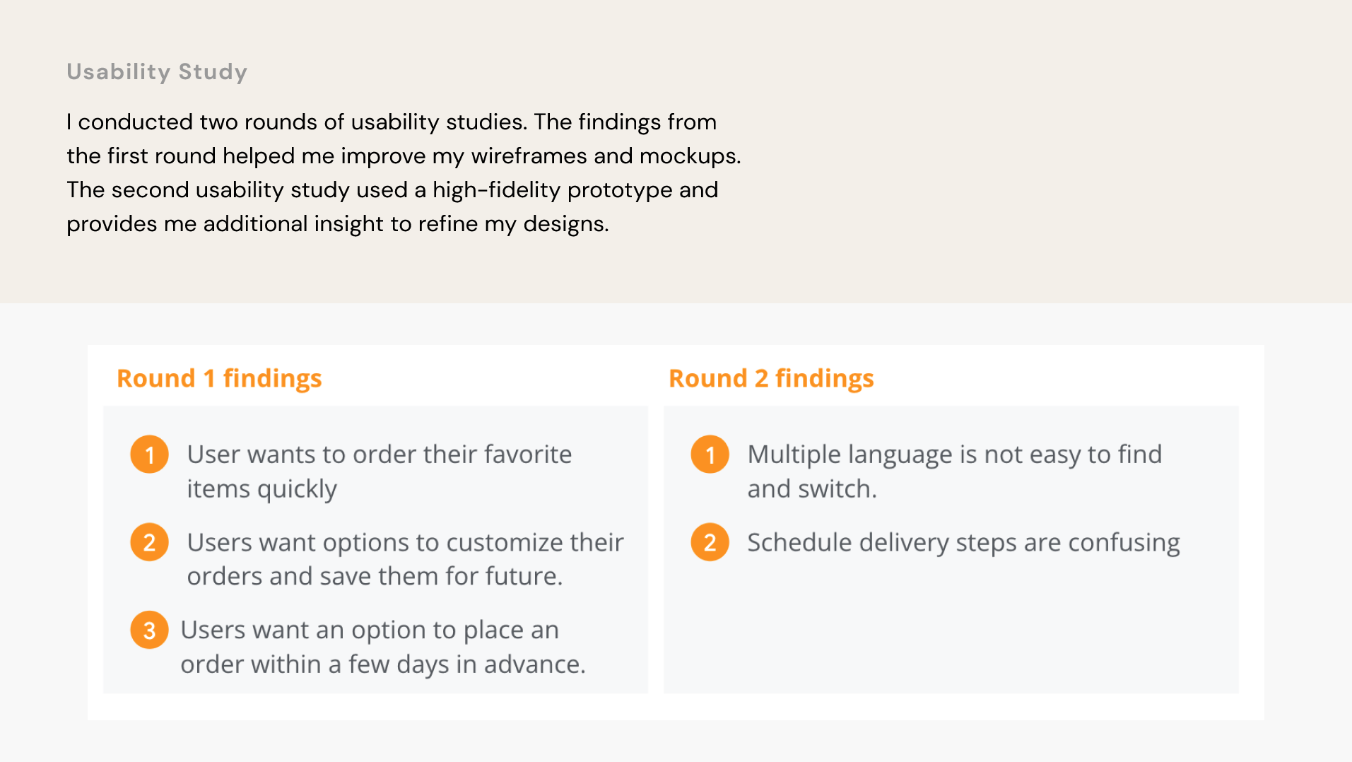
Usability Study:
Refining the design & Mockups:
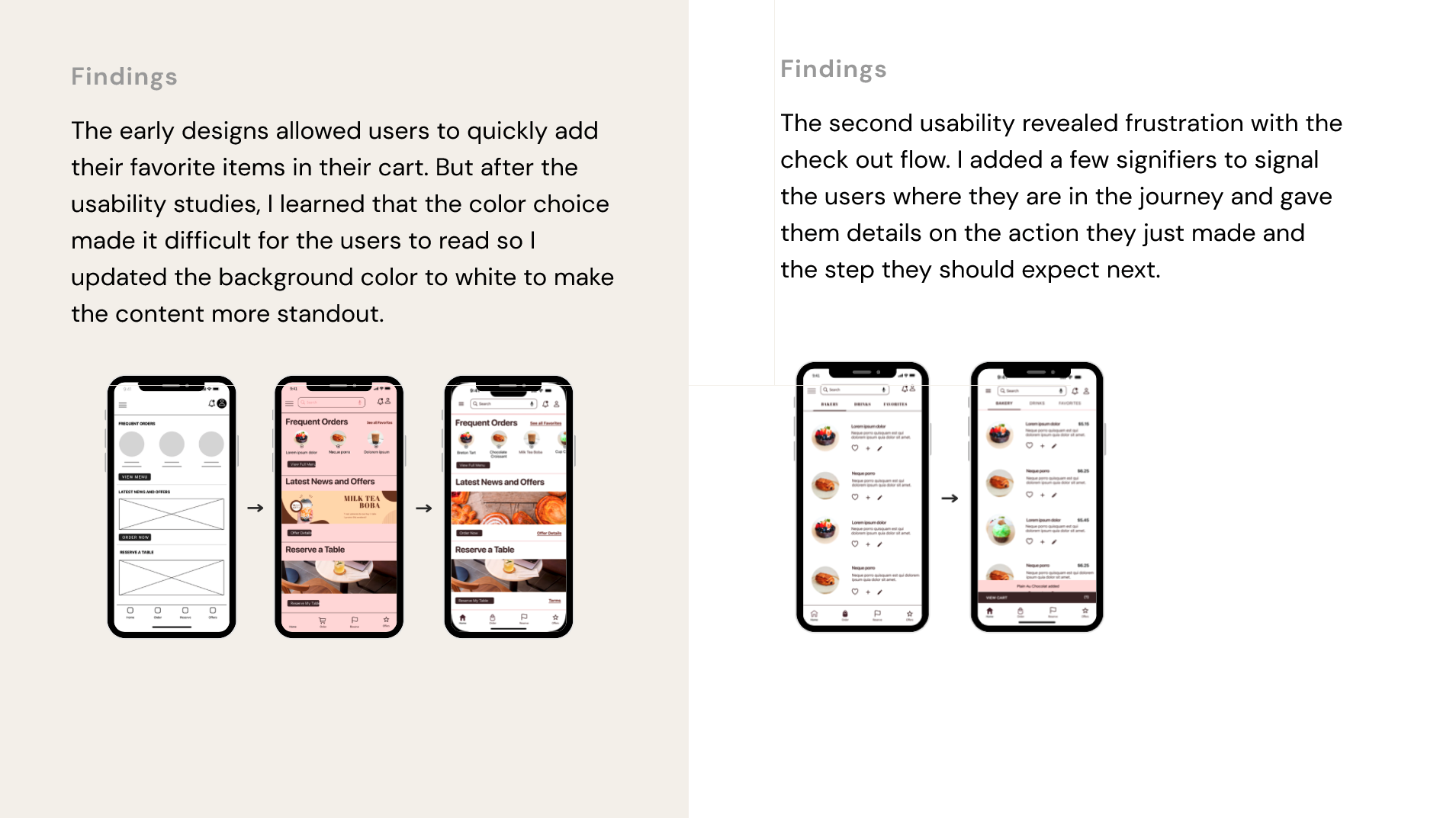
The early designs allowed users to quickly add their favorite items in their cart. But after the usability studies, I learned that the color choice made it difficult for the users to read so I updated the background color to white to make the content more standout.
The second usability revealed frustration with the check out flow. I added a few signifiers to signal the users where they are in the journey and gave them details on the action they just made and the step they should expect next.
Accessibility consideration:
- Accessibility Considerations:Provided language switch options for non-English speaking users.
- Provide voice control search functionality
- Used icons to help user navigate easier
Key Takeaways:
Impact:
- The app helps Mooeey’s customers quickly order items in advance and save their time and shows the customers that Mooeey’s Bakery really always strives to meet their needs.
What I learned:
- While designing the Mooeey’s Bakery app, I learned that it takes a lot of studies and feedback improve the designs. The work has not done and still need additional iteration to get it to the finish line.
Next Steps:
- Conduct another round of usability study to validate if the identified pain points have been effectively addressed.
- Conduct another user research to identify new areas of need or improvement.
- Iterate the designs based on new findings.
Let's talk


